Creating a Location page template based on the location page mockup.
Category: design
-
Interactive Blocks
I built out two custom blocks that can be embedded into any layout, post, or page.

Find
Care Now
Urgent Care →

Primary Care →

Specialty Care →

Telehealth →

Find
Care Now
Urgent Care →

Primary Care →

Specialty Care →

Telehealth →
Since the hard part is knocked out, we can go back in and give it a bit more style and work on some of the details. All of these are individually editable via the Gutenberg theme editor. The originals are locked down but you can duplicate and place anywhere in a layout.
I added an off-canvas navigation block that’s in the current header. The bottom menus there are controlled by the secondary navigation in the admin.
I added the JavaScript needed to auto-hide the navigation header up scrolling down and returning it upon scrolling up.
-
Mockups
Got a couple mockups for building some custom blocks.


-
Layouts
Try and keep the default layouts very simple so that the site maintains consistency. Use full width and avoid the sidebar for the defaults.
- Spacing
- Width Options
- Padding Options
- Templates
- Index
- Posts
- Page
- Page No Title
- Page No Padding
- Page Sidebar
- Page Subnav
- Search Results
- Archives
- Patterns
- Banner
- Cover
- Hero
- Grid
- Grid Gallery
- Grid Media
- Short Heading
- Poster
- Call to Action
Other Layouts
About the book
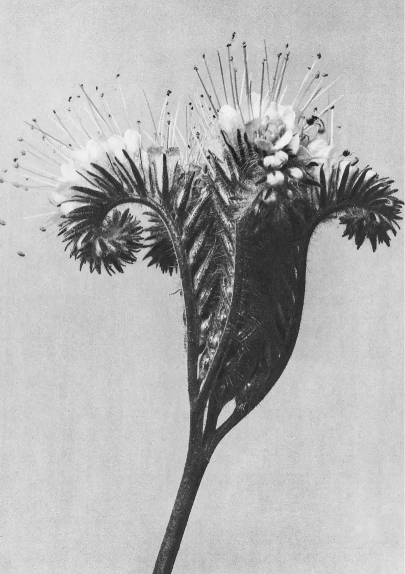
This exquisite compilation showcases a diverse array of photographs that capture the essence of different eras and cultures, reflecting the unique styles and perspectives of each artist. Fleckenstein’s evocative imagery, Strand’s groundbreaking modernist approach, and Kōno’s meticulous documentation of Japanese life come together in a harmonious blend that celebrates the art of photography. Each image in “The Stories Book” is accompanied by insightful commentary, providing historical context and revealing the stories behind the photographs. This collection is not only a visual feast but also a tribute to the power of photography to preserve and narrate the multifaceted experiences of humanity.
About Us
Fleurs is a flower delivery and subscription business. Based in the EU, our mission is not only to deliver stunning flower arrangements across but also foster knowledge and enthusiasm on the beautiful gift of nature: flowers.

We’re a studio in Berlin with an international practice in architecture, urban planning and interior design. We believe in sharing knowledge and promoting dialogue to increase the creative potential of collaboration.
Shore with Blue Sea
Eleanor Harris (American, 1901-1942)
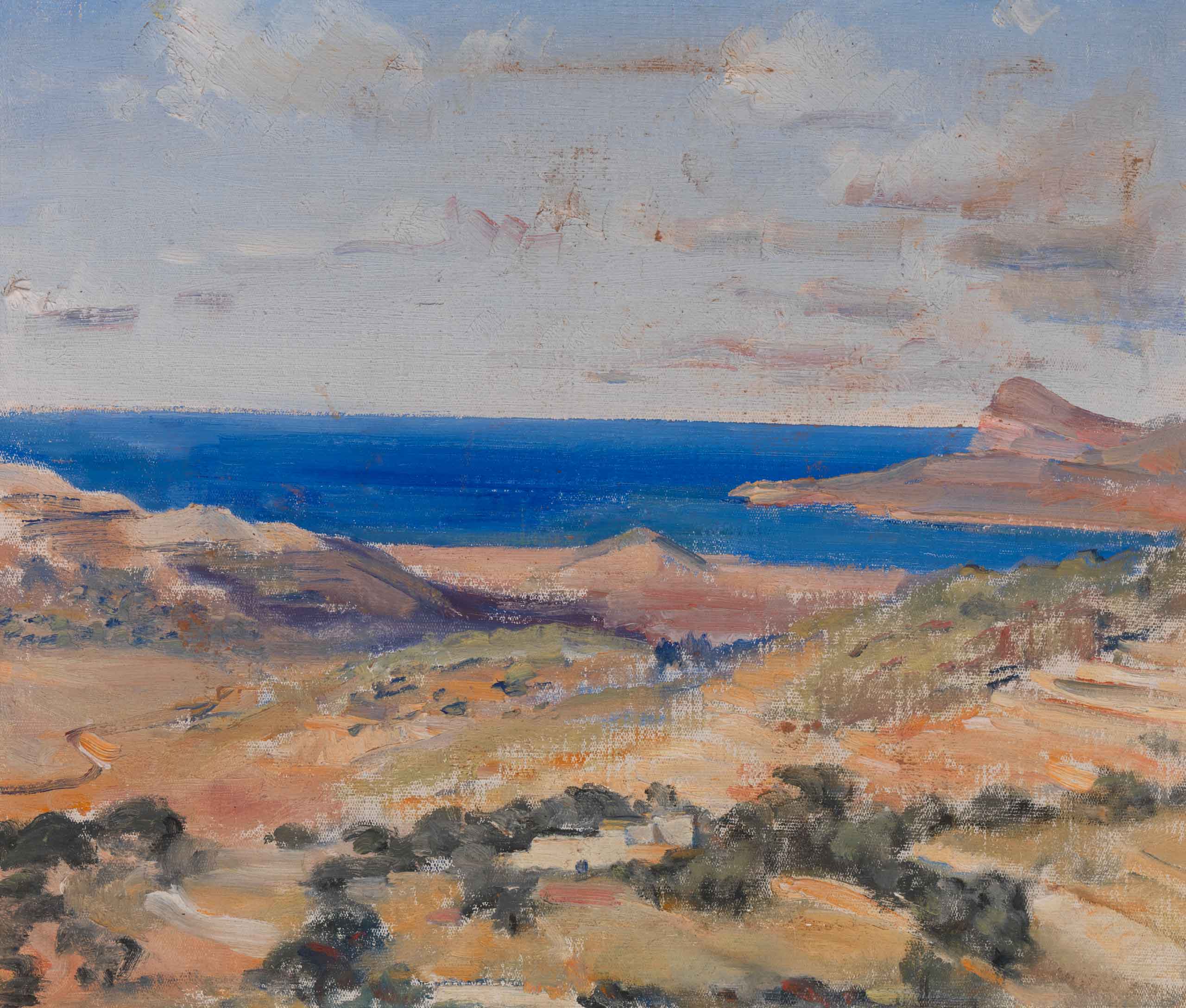
The voyage had begun, and had begun happily with a soft blue sky, and a calm sea.
Single
Enrich our growing community.
- General admission and member discounts for one adult
- One free ticket per special exhibition
- Two single-use guest passes per year
Family
Support special exhibitions.
- General admission and member discounts for two adults
- Four free tickets per special exhibition
- Four single-use guest passes per year
Patron
Take support to the next level.
- General admission and member discounts for two adults
- Five free tickets per special exhibition
- Six single-use guest passes per year

Open Spaces
Opening
Party
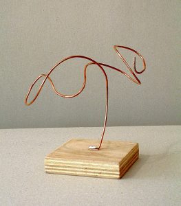
Airplane
Copper wire, wood base. I created this piece in late 2008. For this work, I aimed to convey both the industrial heaviness of an airplane, but also the cloudlike floating quality you feel when you’re in one.
Location:
82 Main St. Brooklyn, NYDate:
October 24, 2021They followed her on to the deck. All the smoke and the houses had disappeared, and the ship was out in a wide space of sea very fresh and clear though pale in the early light. They had left London sitting on its mud. A very thin line of shadow tapered on the horizon, scarcely thick enough to stand the burden of Paris, which nevertheless rested upon it. They were free of roads, free of mankind, and the same exhilaration at their freedom ran through them all.
The ship was making her way steadily through small waves which slapped her and then fizzled like effervescing water, leaving a little border of bubbles and foam on either side. The colourless October sky above was thinly clouded as if by the trail of wood-fire smoke, and the air was wonderfully salt and brisk. Indeed it was too cold to stand still. Mrs. Ambrose drew her arm within her husband’s, and as they moved off it could be seen from the way in which her sloping cheek turned up to his that she had something private to communicate.
Our small team is a group of driven, detail-oriented people who are passionate about their customers.
Embark
ON A HIKING
adventure and explore the beauty of nature’s best…
In the
WOODS.
Walk
In the
Park
—01.03
Even the bitterest fruit has sugar in it.
– Terry a O’Neal
The trees that are slow to grow bear the best fruit.
– Molière
- Spacing
-
Typography
I’ll lay out a decent selection of common typography configurations here for customizing. I create the font selection feature in the editor and add a series of custom selectable patterns to match the font combinations. This will make it easier to create consistent page layouts across different sections and sites.
Style Guide
- Century Gothic ( default )
- Berkeley Pro
- uses annual licensing for .woff/.woff2 web fonts.
Myriad Pro- Formata
- ECH – Avant Garde Gothic Bold, Standard and Berkeley Oldstyle Bold Italic
- AAMC – Trajan Pro Bold and Formata Medium.
- affiliated line – ITC Berkeley Oldstyle Italic.
- Entity names are Century Gothic Bold
Self Regional
Healthcare
Healthcare. Connected.
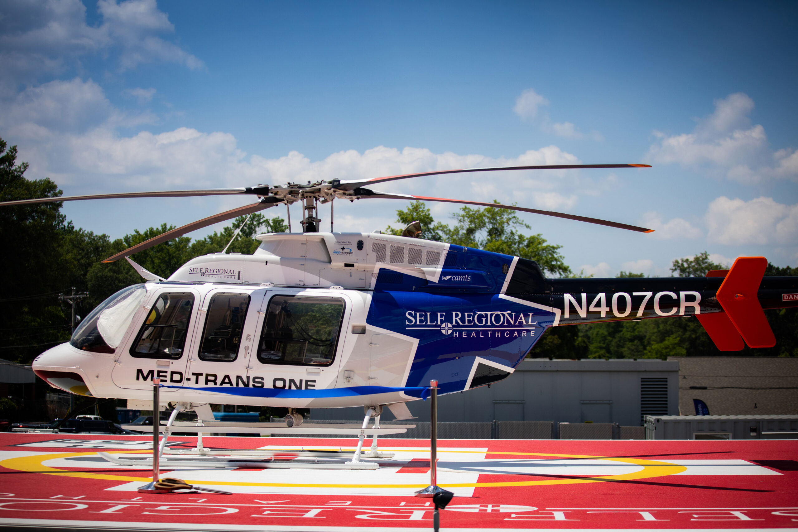
MED-TRANS ONE
Century Gothic
Century Gothic
Century Gothic
Century Gothic
Century Gothic
Century Gothic
A B C D E F G H I J K L M N O P Q R S T U V W X Y Z
a b c d e f g h i j k l m n o p q r s t u v w x y z
1 2 3 4 5 6 7 8 9 0[M] Lorem ipsum dolor sit amet, consectetur adipiscing elit. Ut scelerisque sit amet nisi nec hendrerit. Nam pretium arcu quis metus viverra rhoncus sit amet egestas odio. Morbi dignissim, felis id placerat auctor, dolor massa condimentum erat, sed dictum neque ipsum vitae leo. In ex dui, tincidunt nec varius ut, malesuada id neque.
[S] Vestibulum dapibus id nunc aliquet tristique. Donec vehicula diam nulla, non placerat justo ullamcorper eu. Suspendisse iaculis erat ante, quis pharetra dolor tempor vitae. Duis facilisis consequat justo, sed tincidunt purus lobortis et. Vestibulum commodo nisi sit amet felis maximus viverra. Vestibulum porttitor arcu vitae eleifend commodo. Fusce vel risus efficitur, euismod magna et, elementum ante. Pellentesque leo urna, tincidunt nec pretium vel, ornare vel lorem.
[XS] Vestibulum dapibus id nunc aliquet tristique. Donec vehicula diam nulla, non placerat justo ullamcorper eu. Suspendisse iaculis erat ante, quis pharetra dolor tempor vitae. Duis facilisis consequat justo, sed tincidunt purus lobortis et. Vestibulum commodo nisi sit amet felis maximus viverra. Vestibulum porttitor arcu vitae eleifend commodo. Fusce vel risus efficitur, euismod magna et, elementum ante. Pellentesque leo urna, tincidunt nec pretium vel, ornare vel lorem.
[L] Lorem ipsum dolor sit amet, consectetur adipiscing elit. Ut scelerisque sit amet nisi nec hendrerit. Nam pretium arcu quis metus viverra rhoncus sit amet egestas odio. Morbi dignissim, felis id placerat auctor, dolor massa condimentum erat, sed dictum neque ipsum vitae leo. In ex dui, tincidunt nec varius ut, malesuada id neque.
[XL] Lorem ipsum dolor sit amet, consectetur adipiscing elit. Ut scelerisque sit amet nisi nec hendrerit. Nam pretium arcu quis metus viverra rhoncus sit amet egestas odio. Morbi dignissim, felis id placerat auctor, dolor massa condimentum erat, sed dictum neque ipsum vitae leo. In ex dui, tincidunt nec varius ut, malesuada id neque.
[XXL] Lorem ipsum dolor sit amet, consectetur adipiscing elit.
Century Gothic Bold
Century Gothic Bold
Century Gothic Bold
Century Gothic Bold
Century Gothic Bold
Century Gothic Bold
A B C D E F G H I J K L M N O P Q R S T U V W X Y Z
a b c d e f g h i j k l m n o p q r s t u v w x y z
1 2 3 4 5 6 7 8 9 0Lorem ipsum dolor sit amet, consectetur adipiscing elit. Ut scelerisque sit amet nisi nec hendrerit. Nam pretium arcu quis metus viverra rhoncus sit amet egestas odio. Morbi dignissim, felis id placerat auctor, dolor massa condimentum erat, sed dictum neque ipsum vitae leo. In ex dui, tincidunt nec varius ut, malesuada id neque. Vestibulum dapibus id nunc aliquet tristique. Donec vehicula diam nulla, non placerat justo ullamcorper eu. Suspendisse iaculis erat ante, quis pharetra dolor tempor vitae. Duis facilisis consequat justo, sed tincidunt purus lobortis et. Vestibulum commodo nisi sit amet felis maximus viverra. Vestibulum porttitor arcu vitae eleifend commodo. Fusce vel risus efficitur, euismod magna et, elementum ante. Pellentesque leo urna, tincidunt nec pretium vel, ornare vel lorem.
Berkeley Pro ITC Old Style
Berkeley Pro ITC Old Style
Berkeley Pro ITC Old Style
Berkeley Pro ITC Old Style
A B C D E F G H I J K L M N O P Q R S T U V W X Y Z
a b c d e f g h i j k l m n o p q r s t u v w x y z
1 2 3 4 5 6 7 8 9 0Lorem ipsum dolor sit amet, consectetur adipiscing elit. Ut scelerisque sit amet nisi nec hendrerit. Nam pretium arcu quis metus viverra rhoncus sit amet egestas odio. Morbi dignissim, felis id placerat auctor, dolor massa condimentum erat, sed dictum neque ipsum vitae leo. In ex dui, tincidunt nec varius ut, malesuada id neque. Vestibulum dapibus id nunc aliquet tristique. Donec vehicula diam nulla, non placerat justo ullamcorper eu. Suspendisse iaculis erat ante, quis pharetra dolor tempor vitae. Duis facilisis consequat justo, sed tincidunt purus lobortis et. Vestibulum commodo nisi sit amet felis maximus viverra. Vestibulum porttitor arcu vitae eleifend commodo. Fusce vel risus efficitur, euismod magna et, elementum ante. Pellentesque leo urna, tincidunt nec pretium vel, ornare vel lorem.
Typeset
Styles
- creative touches like ligatures and drop caps
- clean fallback with woff fonts
- avoid flash of unstyled content
-
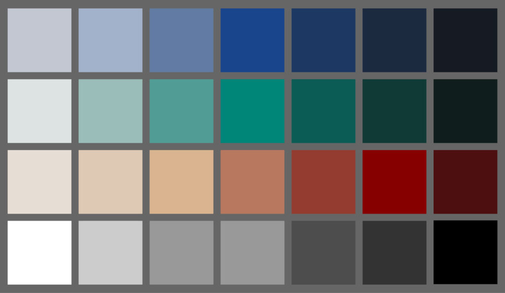
Color Palette
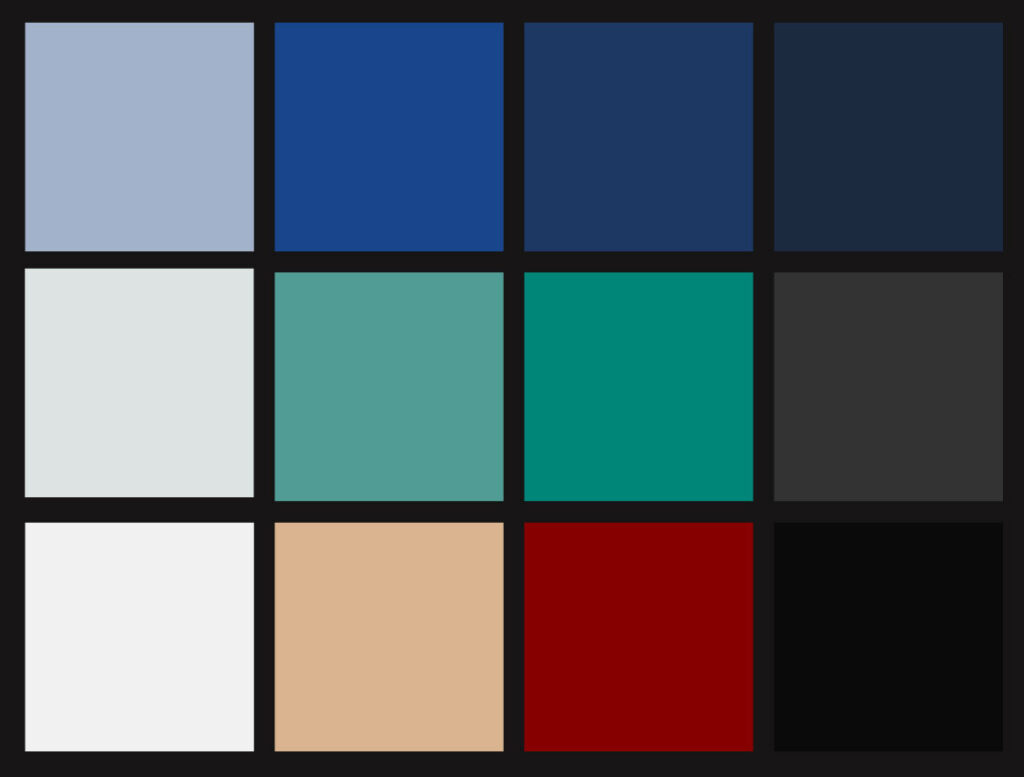
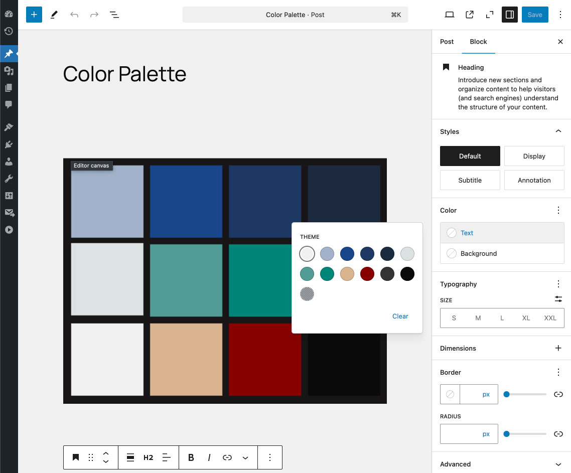
Blue
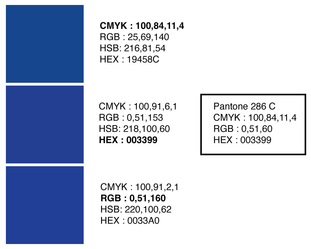
I noticed that the Branding Standards had the hex color #003399 but my color picker was matching it up slightly different. A common match for Pantone 286 C is the bottom swatch #0030A0. We’re going to stick with the #19458C HEX for the primary blue.
Per comment below from Andy. Additional color palette blue is based on 285U with CMYK values of 78, 32, 0, 0 and we also use K at 20% and 60%
These are generated using the two primary blues @ -77% saturation & 77/97% dark/light gradients. ( see demo )
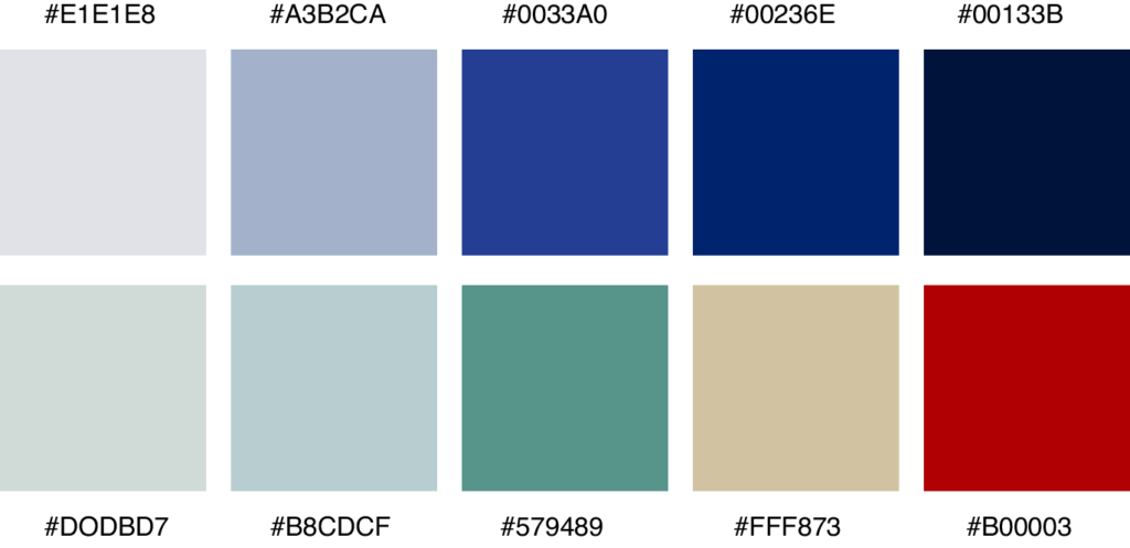
Green & Tan
Abbeville Green – #008578 – Pantone 3283 C
Edgefield Tan – #D9B48F – Pantone 727 C
Blue – #0033A0 – #19458C – Pantone 286 C
I’m working through multiple choices so that I’ll be able to set the colors in the editor palette to maintain consistency across layouts. We’ll need a ‘medical’ red for alerts and buttons. We’ll need both dark and light consistent background colors. Traditional medical colors such as scrubs are a good reference. Adjectives: sterile, clean, clear, bright, comforting, soothing, professional, objective.
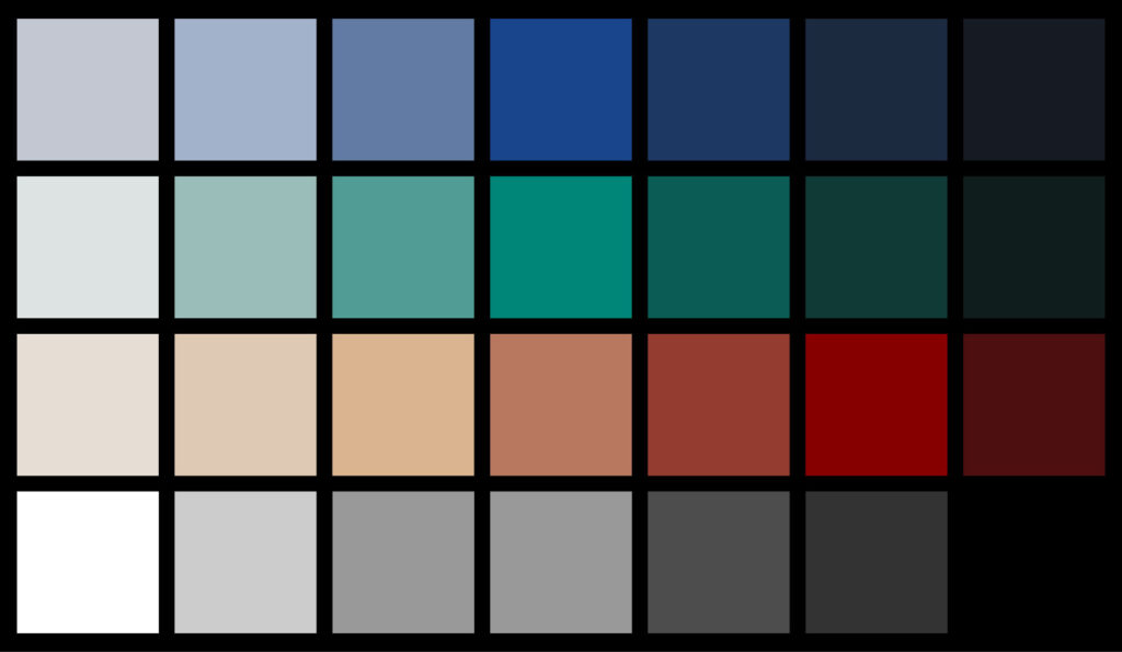
Edgefield & Abbeville logos
haven’t matched the Pantone properly – estimation for now

Scrubs
Focusing primarily on the two lighter shades will give it a very clean and sterile effect with less contrast. I’m leaning heavily towards reducing any inverse layout to keep it ‘clean’. I really like the association with medical from the scrubs colors.
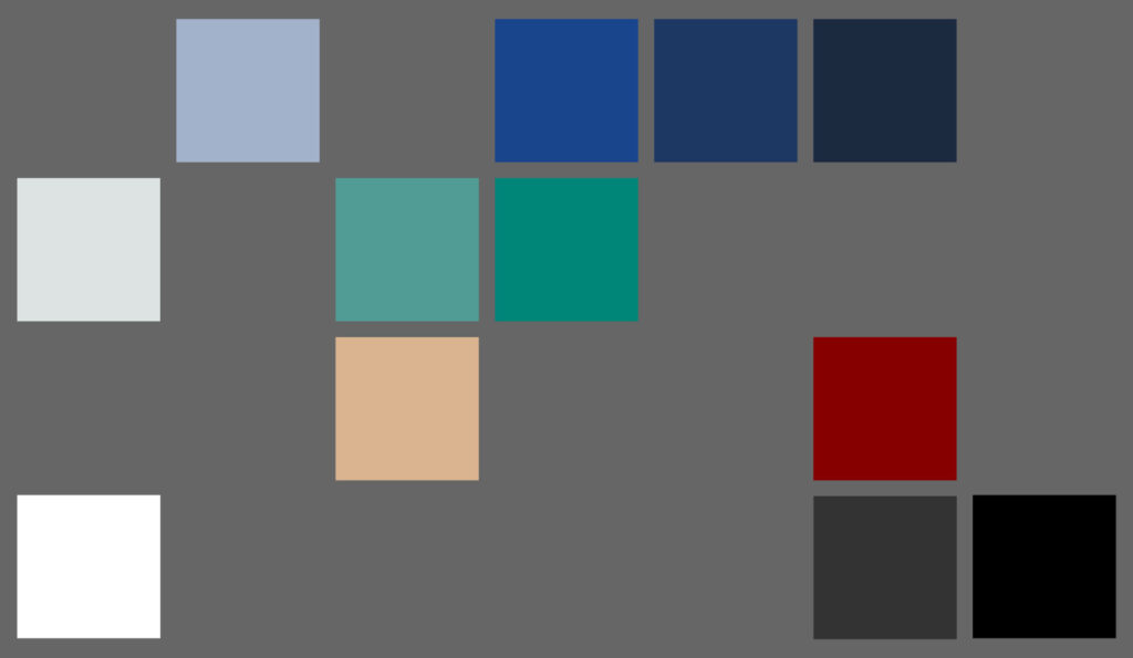
Palette
I’ve nailed down to this larger palatte and removed the the colors in the lower image for a minimal styling. I was informed that we wanted to stay away form the bright orange/red spectrum that another system uses, but given the use of red both in medical and as a system alert/banner/buttons, I tried to mix it with the existing tan for a more muted tone.
I’ll work from this palette on the redesign although I may run into cases where I need to an additional color. After the staging is up for preview, I’ll limit the editor.